
Real Estate Landing Page: What Actually Converts

Most builders send paid traffic to their homepage. That single decision wastes more ad budget in Punjab than any targeting mistake we see. A real estate landing page exists to do one job that a homepage structurally cannot do: continue the exact conversation the ad started.
Someone taps an ad about 3 BHK flats in Sector 66 with possession next year. They land on a homepage listing four projects, an About Us section and a contact form. The thought that follows is not curiosity. It is confusion, and confusion costs you the click you already paid for.
Here is what to build instead, in the order that matters.

The one-to-one rule
One ad, one offer, one page, one action. Break any part of that and conversion falls.
If you run three campaigns for three configurations, you need three pages. This feels like extra work and it is, but the alternative is paying search and social prices to deliver a mismatched message. The cost of the mismatch is invisible, which is exactly why it persists.
The test is simple. Read the ad headline, then read the first line of the page. If a stranger would not recognise them as the same conversation, the page is wrong.
Speed is not a technical detail, it is the offer
Property traffic in India is overwhelmingly mobile, often on patchy connections, and frequently in the evening when networks are congested. A page that takes six seconds to render has lost a large share of its visitors before they saw a single word.
Google publishes a public, measurable standard for this in Core Web Vitals, which defines loading, interactivity and visual stability thresholds you can test yourself rather than take on trust. Run your page through it before you spend another rupee on traffic pointed at it.
The usual culprits on a property page, in order of damage: uncompressed render images, an autoplaying video above the fold, embedded map iframes loading on arrival, and four tracking scripts firing before content paints.
What belongs on a real estate landing page
In this order, because order is most of the battle.
- The specific promise, restated. Configuration, locality, price band, possession timeline. The four things a buyer is actually filtering on.
- The price, or an honest price band. Hiding it does not create curiosity. It creates unqualified enquiries and a sales team that burns hours discovering budget mismatches.
- Proof that construction is real. Dated site photographs beat renders. Buyers here have learned to discount renders entirely.
- The RERA registration number, displayed. Legally required in advertising, and it doubles as a trust signal that most competitors bury.
- One form, short. Name and number. Every additional field costs completions.
- A messaging option beside the form. A large share of buyers will message when they will not fill a form.
- Location, as a static image with directions rather than a live embedded map that slows everything down.

What to cut
| Remove | Why |
|---|---|
| Site-wide navigation menu | Every link is an exit from a page you paid to fill |
| Chairman message and company history | Nobody buying a flat reads this before enquiring |
| Long amenity list with icons | Undifferentiated. Every project claims the same twelve |
| Autoplay video hero | Destroys load time on mobile for marginal benefit |
| Multiple competing buttons | Two calls to action perform worse than one |
| Long qualification forms | Qualify on the call, not on the form |
The navigation menu is the one builders resist cutting hardest, and it is the one with the clearest evidence against it. The page has one job. Give it one path.
The form versus instant form question
On Meta you can skip the page entirely and use an instant form inside the platform. Cheaper leads, almost always. Lower intent, almost always. That is a genuine trade-off rather than a best practice, and the right answer depends on whether your sales team is stronger at volume or at qualification.
The structural argument for sending traffic to your own page is that it builds an asset. Every visitor is a pixel event, every pixel event feeds retargeting, and none of that accumulates if the interaction never leaves the platform. We set out how the two platforms differ on this in our Google Ads versus Meta Ads comparison.
Measuring whether the page works
Conversion rate on its own will mislead you. A page converting at 12 per cent that sends unqualified enquiries is worse than a page converting at 4 per cent that fills your calendar with site visits.
Track four numbers: page load time on mobile, form completion rate, enquiry to contact rate, and enquiry to site visit rate. The last one is the only one that connects to revenue, and it is the metric we argue for throughout our breakdown of what a real estate lead actually costs.
Where the page sits in the wider journey, from first impression to a booked visit, is mapped in our real estate ad funnel breakdown.
Three page types most builders actually need
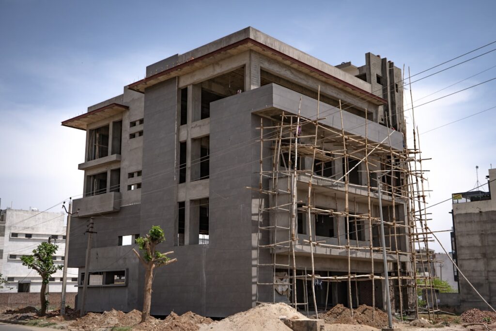
Rather than designing something new for every campaign, most developers in the Tricity end up needing three templates and then varying the content inside them.
The project page. One project, all configurations, aimed at someone who already knows the project name. This is where brand searches and hoarding traffic should land, and it is the only one of the three that can reasonably carry a longer story about the development.
The configuration page. One configuration in one locality, built for search traffic such as 3 BHK in Kharar under 60 lakh. Narrower than the project page and reliably higher converting, because it answers a specific query with a specific promise instead of asking the visitor to filter for themselves.
The offer page. A time-bound scheme, a launch price, a revised payment plan. Short shelf life by design, and the only page type where urgency is honest rather than manufactured. Take it down when the offer ends, because a stale countdown does more damage to trust than no countdown at all.
Each one is a real estate landing page in the strict sense of one offer and one action. What differs is the traffic pointed at it, and pointing search traffic at a project page when a configuration page was needed is the most common structural mistake we end up correcting.
Test one thing at a time
The usual approach is to redesign everything at once, watch the number move, and learn nothing about which change caused it. Change the headline alone and you find out whether the promise was wrong. Change the form length alone and you find out whether friction was the problem. Change six things and you have a new page and no knowledge.
Run each test until you have enough enquiries for the difference to mean something, rather than until the number happens to look good. On the volumes a typical Punjab project generates, that is usually weeks rather than days. Anyone offering a confident conclusion from a weekend of traffic is reading noise.
Frequently asked questions
Do I need a separate real estate landing page for every campaign? For every distinct offer, yes. Three configurations at three price points are three conversations, and one page cannot hold all three without diluting each.
Should I show the price? Yes, or an honest band. Withholding it shifts the qualification burden onto your sales team and fills the pipeline with people who were never in your range.
Can I just use a portal listing instead? A portal listing is a template you do not control and share with competitors. It is a reasonable supplement and a poor replacement.
How long should the page be? Long enough to answer configuration, price, location, possession and legitimacy. Usually shorter than builders expect and better organised than they manage.
Want your landing page reviewed? Send us the URL and the ad that points at it, and we will tell you where the mismatch and the load-time losses are — free, no obligation.